Peaks & Prairies
Experience the intersection of nature & jewelry
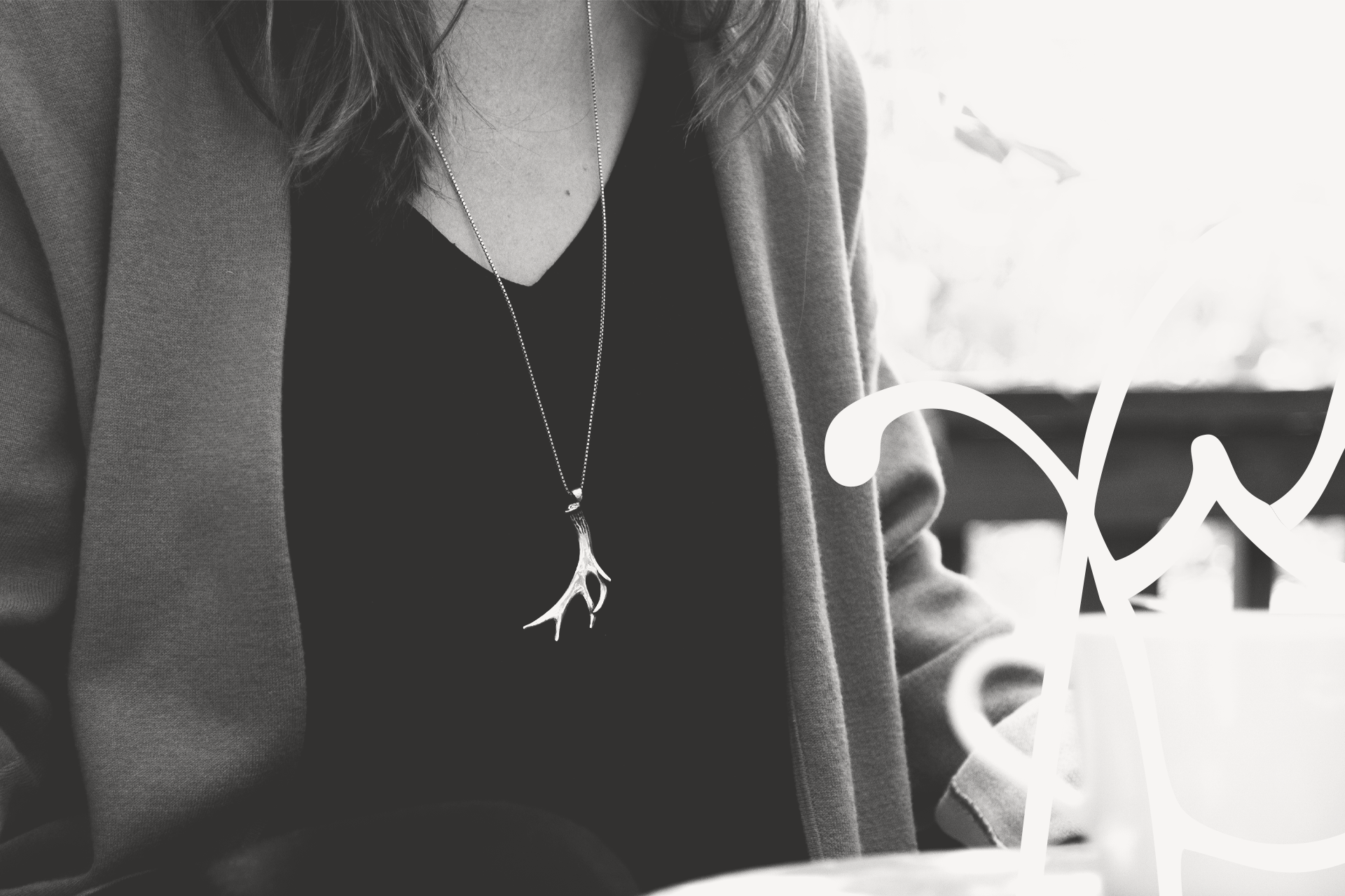
Peaks & Prairies is a local handcrafted jewelry brand deeply rooted in Canadian landscapes, nature, and artistic expression—tannerstrachanCREATIVE was commissioned to deliver a full suite of brand photography and product imagery to level up their visual presence. The goal: reinforce their unique story, connect emotionally with their ideal customer, and ensure the craft of their jewelry shines through in every pixel.
A visual catalogue created for a handcrafted jewellery brand rooted in wild places.
Project Overview
Peaks & Prairies didn’t come to us simply for a photoshoot. They came to us looking for a complete visual catalogue of brand and product imagery for their show-stopping jewelry collection. The heart of the business was already beating strong: a founder who sketched her way through childhood, a jewellery line inspired by the Alberta landscape, and a 10% donation model that gives back to the Nature Conservancy of Canada. But when it came to their visual presence, something didn’t quite land. Their imagery lacked the professional finish, visual cohesion, and overall emotion to properly communicate what made the brand truly one-of-a-kind.
So we stepped up. Not to reinvent—but to illuminate. We believe brand photography should feel like a conversation, not just a billboard. So we set out to create a visual language that honoured the values, textures, and emotional resonance at the core of Peaks & Prairies.

The Challenge
Peaks & Prairies had all the right ingredients—ethical craftsmanship, a founder-driven origin story, and an aesthetic that whispered rather than shouted. But their product photography was disjointed. Some shots felt overly polished, others under-produced. Lifestyle images existed, but they didn’t feel lived in. There was a clear disconnect between what the brand felt like and how it was being visually expressed online.
The mission was clear: build a photo library that could flex across every channel—eCommerce, social, print, and digital—while staying true to the handcrafted essence of the brand. We needed to honour both the quiet magic of the jewellery and the bold, grounded energy of the landscape it came from.


The PROCESS
Our approach was rooted in narrative—this wasn’t a “get the shot and go” kind of project. We began by immersing ourselves in the Peaks & Prairies ethos: sustainable values, emotional craftsmanship, and a deep reverence for the natural environment. From there, we built a full-spectrum visual direction designed to stretch across studio product photography, lifestyle brand photography, and web-optimized digital assets. Each decision—lighting, texture, crop, contrast—was intentional, designed to reflect not just what the products look like, but what they feel like.
In studio, we captured detailed, high-res product imagery designed to perform across product pages and packaging inserts. Throughout post-production, our editing choices favoured warmth over sterility. We leaned into earth tones, softened shadows, and kept the imperfections that reminded viewers: this brand is about human touch, not mass production.


The RESULTS
This project was a textbook example of what we live for: a values-driven client, a story worth telling, and a chance to create visuals that go deeper than aesthetics. It pushed us to blend strategic intent with raw creativity. To think beyond “assets” and into atmosphere, feeling, emotional pull.
The result of this photography campaign was a full-spectrum visual system that works hard and looks beautiful. For the Peaks & Prairies team, it meant more than just “better photos”—it meant increased trust from their target audience, longer site engagement, and a library of reusable assets that could stretch across all brand touchpoints.
Product detail shots helped reduce customer hesitation and minimize returns. Lifestyle imagery gave the brand new narrative muscle for social campaigns and emails. Hero shots enhanced homepage performance, making the brand feel elevated yet grounded.
But most importantly, the new visuals finally felt like the brand. The jewelry didn’t just sit on a table—it told a story. And the story wasn’t about hype or trends. It was about craft. Legacy. Connection to land.


The Products
While the brand photography leaned into atmosphere and place, the product photography demanded restraint, clarity, and technical consistency. At the client's request, we developed a full suite of clean, white-backdrop product imagery tailored for the Peaks & Prairies eCommerce store. These shots weren’t about visual drama—they were about trust, precision, and helping customers feel confident with their purchase.
Consistency was everything. We created uniform framing and aspect ratios across all products, ensuring a smooth, high-end browsing experience on their website. The result? A cohesive product grid that aligns with luxury expectations, minimizes buyer hesitation, and supports conversions—without sacrificing the honesty or artistry of the work.
By keeping things minimal, we allowed the jewellery to speak for itself. This clean style also gave Peaks & Prairies total flexibility across platforms—from web store to mobile, email marketing to printed lookbooks. In a world of cluttered visuals and trend-chasing edits, this white-backdrop work grounded the brand in clarity and confidence.
Ready to Reach Out? Keep Scrolling to Connect.
READY To Bring Your Brand To life?
We partner with brands who care. If your brand is seeking this level of visual sophistication, narrative resonance, and ongoing creative partnership—let’s connect and make some cool sh*t together.