LOOP Touring
Project Overview
Loop Touring was co-founded by two solid humans—Andy and Jovana—who, after moving from the city to discover the joys of living in a small mountain town, came up with a mission to help more people disconnect from the daily grind and reconnect with the Rockies. But this wasn’t your average camper rental biz. They wanted to offer something deeper: a reimagined outdoor experience rooted in accessibility, sustainability, and freedom. Their brand needed to speak to first-time explorers and seasoned adventurers alike—without losing sight of their values.
The ask? Build a visual identity that honoured their core pillars—Mother Nature, Reinvention, and Inclusivity—and translate that into a logo and system that felt fresh, rugged, and real. Not performative. Not cookie-cutter.
As we moved through our brand discovery workshop, one idea kept rising to the surface: Reinvention, or Alchemic Change. Reinvention of the self within, Reinvention of the outdoor industry. Reinvention of who gets to belong in wild spaces. Reinvention of how adventure looks and feels. That insight became the creative backbone of the entire project—and the filter through which we made every design decision.
Project Scope
Logo Design
Brand Identity Design
Associated Type + Colours
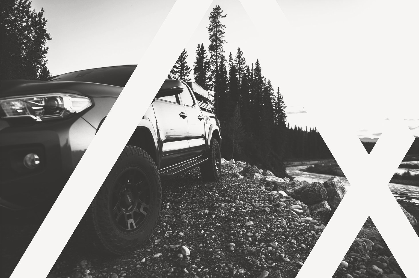
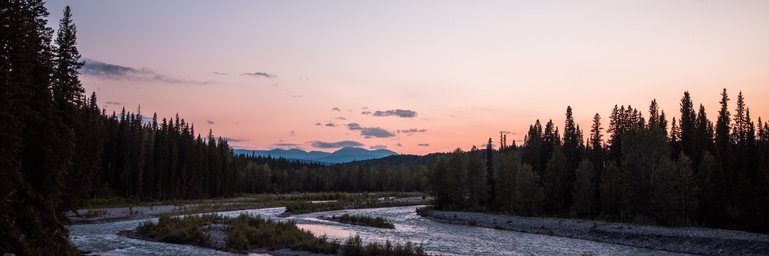
Brand Photography
How Do You Make The Outdoors More Inclusive?
Testimonial
“We had a strong notion of the service we wanted to offer, but we knew we needed help creating a logo & brand that would capture the essence of it in a clear, engaging & professional way.
We are beyond grateful to have worked with tannerstrachanCREATIVE on this project! By enlisting their expertise, we not only were able to create a cohesive brand identity that translated to service bookings, but we did so by way of a creative adventure, as we were guided through each step of the ideation & design process in a fun, playful & engaging way.
Tanner is so calm, kind & personable. He is a delight to work with & together, we were able to create something meaningful that made such an impact on our small business.
We couldn’t recommend tannerstrachanCREATIVE enough!”
Jovana Duke
Co-Founder of Loop Touring
earth
shelter
change
This is Loop.
Our approach with Loop Touring was rooted in alignment: aligning visuals with values, form with function, and story with audience. From the first discovery session, it was clear this wasn’t just about building a “cool” logo—it was about giving form to a bigger purpose. We listened closely to Andy and Jovana’s goals, their vision for inclusivity in the outdoors, and their desire to reinvent what adventure access could look like.
We mapped out their brand foundation with intention—by starting with a collaborative brand workshop to define tone, style, audience archetypes, and brand values. That groundwork became the creative compass for every decision we made moving forward. We weren’t just designing for aesthetics; we were designing to build trust, open doors, and inspire movement.
The result? A strategy that fused minimalism with meaning, allowing the brand to feel premium and grounded—while staying flexible enough to grow alongside their business.
The Logo.
The Loop Touring logo is built on intention. We fused three core symbols into one cohesive mark: the tent for shelter, the alchemic Earth symbol to honour nature, and the delta sign as a universal nod to change. Together, they capture the spirit of the brand—anchored in protection, purpose, and reinvention. These weren’t aesthetic choices. They were values, made visible.
Visually, the logo lives in that sweet spot between rugged and refined—modern enough for digital applications, simple enough to stamp on gear, bold enough to hold its own in the wild. From the minimalist mark to the streamlined palette, every piece of the identity reflects Loop’s philosophy of living simply and adventuring meaningfully.
The final identity system is more than a visual toolkit—it’s a flexible foundation designed to evolve alongside the brand. Whether on the side of a 4x4 or the corner of a digital map, the Loop mark says: you belong out here.
Variations.
The Wordmark.
The ColourS.
The colour palette for Loop Touring needed to do double duty: blend effortlessly into the natural environment, while still sparking energy and action. We focused on tones that felt grounded and wild—natural hues that wouldn’t clash with the Rockies, but would still stand out in the digital and physical spaces where the brand shows up.
By choosing colours rooted in earth, stone, sky, and sun, we created a palette that reflects both the stillness and the strength of the backcountry. These tones aren’t just aesthetic—they evoke mood, movement, and meaning. The final palette strikes a balance between calm and kinetic, allowing the brand to feel approachable yet adventurous, modern yet timeless.
The Typeface.
invent yourself and then reinvent yourself,
don’t swim in the same slough.
invent yourself and then reinvent
yourself
and
stay out of the clutches of mediocrity.
invent yourself then reinvent yourself,
change your tone and shape so often that
they can never categorize you.
reinvigorate yourself and accept what is
but only on the terms that you have invented
and reinvented.
be self-taught.
and reinvent your life because you must;
it is your life and
its history
and the present
belong only to
you.
Charles Bukowski
Ready to Reach Out? Keep Scrolling to Connect.
Let’s make some cool sh*t.
Like what you’re seeing here? Let’s chat! Tell us how we can bring your vision to life or how we can elevate your brand. Reach out, and we’ll get back to you quickly. And no worries—your submissions are safe and secure with us.